App Onboarding Screens: What to Show New Users (and What to Skip)
The first minute in an app decides whether people stay. Here's how to design app onboarding screens that get users to the useful part quickly: when intro slides help, when to ask for sign-up and permissions, and the mistakes that cause early uninstalls.
On this page
- Start with the "aha" moment
- Do you need intro slides at all?
- Sign-up: later is usually better
- Permissions: ask in context
- Patterns for common business apps
- Booking apps
- Shop apps
- Content and news apps
- Member and loyalty apps
- Progressive onboarding: teach in place
- Writing the words on each screen
- Mistakes that cause early uninstalls
- Measure the first-run funnel
- Building it
A new user opens your app for the first time. In the next minute, they'll decide whether it's worth keeping. Every screen between opening the app and getting something useful from it is a chance for them to give up. That's what onboarding is really about: not explaining your app, but getting people to its value as quickly as possible.
Many apps get this backwards, with five swipeable slides of marketing copy, a mandatory sign-up form and three permission pop-ups before anything happens. Here's how to design app onboarding screens that help rather than hinder, with patterns for the most common types of business app.
Start with the "aha" moment#
Before designing any screen, answer one question: what's the moment a new user first feels the app is useful? For a booking app, it's seeing available slots. For a shop, browsing products. For a news app, reading a story. For a loyalty app, seeing the reward balance.
Your onboarding should get people to that moment with as few steps as possible. Everything else, including sign-up, permissions, preferences and tutorials, should either support that goal or wait until later.
Do you need intro slides at all?#
Intro slides, the swipeable welcome screens, are the most common onboarding pattern and the most commonly skipped by users. They help in some situations:
- The app does something unfamiliar that needs a quick explanation.
- There's a key benefit people might not expect, like "We'll remind you before every appointment".
- You need to set expectations, such as "Your first order ships within 2 days".
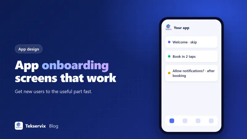
They don't help when they repeat marketing slogans, describe features users can see for themselves, or exist because "apps have them". If you use them, keep it to three or fewer, make each one say something concrete, and always show a Skip button.
Sign-up: later is usually better#
Forcing account creation on the first screen is one of the biggest causes of early drop-off. People haven't seen anything yet, so asking for their email and a password feels like a cost with no visible reward.
A better pattern for most business apps:
- Let people browse without an account: products, menus, timetables, articles.
- Ask them to sign in when they do something that needs it, like booking, buying, saving or commenting.
- Offer quick options like Sign in with Apple or Google, plus email.
- Explain the benefit in one line: "Create an account to manage your bookings and get reminders."
Note that Apple's guidelines generally require Sign in with Apple if you offer other third-party sign-in options on iOS. Plan for that early.
Some apps genuinely need an account first, like banking, a member-only portal or a company's internal app. Even then, make sign-in as quick as possible and remember the user so they rarely have to do it again. Biometric sign-in with Face ID or a fingerprint helps a lot here.
Permissions: ask in context#
Notification, location, camera and contacts permissions are all requested through system pop-ups. If a user says no, getting them to change it later means sending them to settings, which few people do. So the timing of the first request matters.
- Notifications: ask after the user books, orders or subscribes, with a line like "Want a reminder before your appointment?"
- Location: ask when they tap "Find nearest store", not on launch.
- Camera: ask when they tap "Scan QR code".
A short explanation screen in your own design, shown just before the system prompt, increases acceptance because people understand why. Our article on push notification examples covers what's worth asking permission for.
Patterns for common business apps#
Booking apps#
Open straight to services or available times. Ask for sign-in at the confirm step. Request notification permission right after the booking is made.
Shop apps#
Open to featured products or categories. Let people add to basket without an account; offer guest checkout or quick sign-in at checkout. Ask for notifications after the first order ("Get shipping updates").
Content and news apps#
Open to content immediately. Optionally ask for topic preferences after the user has read a couple of articles. Ask about notifications for breaking news later.
Member and loyalty apps#
Here sign-in is the point, so make it fast: phone number with a one-time code, or existing account credentials, then go straight to the member card or balance.
Progressive onboarding: teach in place#
Instead of front-loading every tip, show small hints when they're relevant. A tooltip the first time someone opens the bookings tab. A short note the first time they see the loyalty card. An empty state that says what to do: "No bookings yet. Tap Book to choose a time." Help that appears in context is read; help that appears up front is skipped.
Writing the words on each screen#
Onboarding copy gets read in a hurry, often with one thumb. Short headings that say what the user gets ("Book in two taps", "Reminders before every visit") beat clever slogans. Buttons should describe the action: "Choose a time" is clearer than "Continue", and "Not now" feels kinder than "Skip" on a permission explainer.
Use the same words your customers use. If they say "appointments", don't call them "sessions" in the app. If your website says "basket", the app shouldn't switch to "cart". Small mismatches make people wonder whether they're in the right place.
Finally, check the screens on a small, older phone with the text size turned up. A layout that looks spacious on a designer's large screen can push the main button off the bottom on a budget handset, and that's a surprisingly common reason people never get past the first screen.
Mistakes that cause early uninstalls#
- More than three intro slides with no Skip button.
- A sign-up wall before any content.
- Asking for every permission on first launch.
- Long forms asking for information you don't need yet, like birthdays or addresses.
- A blank or broken screen when there's no internet connection.
- Onboarding that can't be revisited, leaving users lost when they skip it.
Measure the first-run funnel#
Track how many new users reach each step: open the app, view content, sign up, complete the key action. Look for the biggest drop and fix that step first. A simple analytics setup is enough; our guide to mobile app analytics lists the events worth tracking.
Building it#
If your app is based on your website, the first-run experience mostly comes from your site, so the advice above applies to your mobile pages as much as the app shell. If you want native capabilities on top, our Native App Builder adds offline mode and dark mode from $35 a month, with Face ID and fingerprint sign-in on the Pro plan. Whichever route you choose, test the first minute with someone who has never seen your app, and watch where they hesitate.
Frequently asked questions
How many onboarding screens should an app have?
As few as you can get away with. For many business apps, zero to three intro screens is enough. If people need more explanation than that, the app itself may need simplifying.
Should an app make users sign up before they can use it?
Only if the app genuinely can't work without an account. Letting people browse first and asking for sign-up when they try to do something that needs it, like booking or saving, usually leads to more sign-ups, not fewer.
When should an app ask for notification and location permissions?
When the user does something that benefits from them, with a short explanation first. Asking for everything on the first screen leads to many refusals, which are hard to reverse later.

Tekservix Team
The team behind Tekservix
The Tekservix Team builds and supports Tekservix: WhatsApp and SMS APIs, AI tools, invoicing, PDF and SEO tools for growing businesses. We write practical, tested guides based on what we see our customers do every day.
More articles from the Tekservix Team