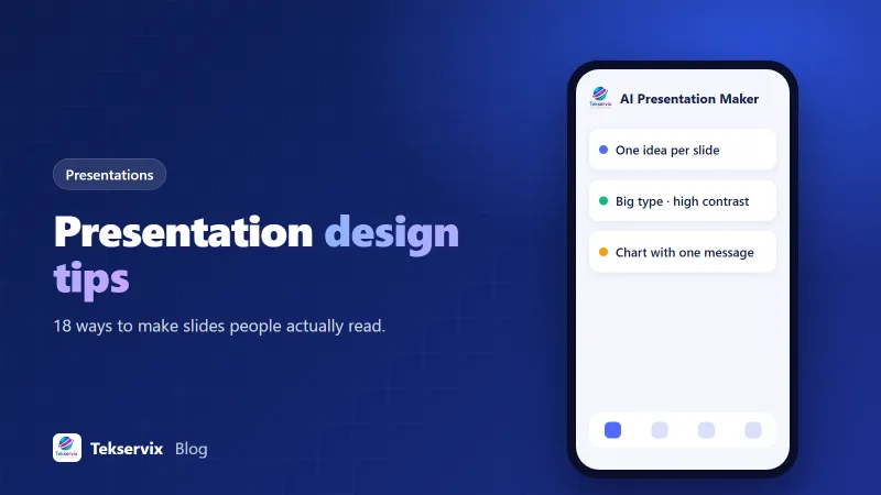
Presentation Design Tips: 18 Ways to Make Slides People Actually Read
Most bad slides have the same problems: too much text, tiny fonts, busy charts and no clear point. These presentation design tips fix them, whether you're pitching investors, training staff or presenting results to a client.
On this page
- Structure first
- 1. Know your one-sentence message
- 2. Outline before you design
- 3. Use headlines that make a point
- 4. One idea per slide
- Text and type
- 5. Cut the words
- 6. Make text big
- 7. Pick one or two fonts
- 8. Left-align text
- Colour and layout
- 9. High contrast always
- 10. A limited palette
- 11. Leave white space
- 12. Keep layouts consistent
- Charts, data and images
- 13. One message per chart
- 14. Choose simple chart types
- 15. Round numbers
- 16. Use real images, used large
- Delivery details
- 17. Use speaker notes
- 18. Test on the real setup
- A quick before-and-after
- How long should a deck be?
- Using AI for the first draft
- The checklist
You've sat through it. Someone clicks to a slide with eleven bullet points in 14-point type, says "I know you can't read this, but...", and then reads it to you. Within a minute, half the room is checking email.
Good slides aren't about fancy design skills. They're about making one point at a time, clearly enough that people can take it in while still listening to you. Here are presentation design tips that work for pitches, training sessions, sales meetings and client reports.
Structure first#
1. Know your one-sentence message#
Before opening any slide software, write down the single thing you want people to remember. "We should move support to WhatsApp because customers reply faster there." Every slide should support that sentence. If one doesn't, cut it.
2. Outline before you design#
Write slide titles as a list, in order, on paper or in a document. Read them aloud. If the titles alone tell the story, the structure works. Design comes after.
3. Use headlines that make a point#
"Q3 results" is a label. "Q3 sales grew 18%, mostly from repeat customers" is a message. Action titles like this mean people get the point even if they glance away.
4. One idea per slide#
Slides are free. If a slide makes two points, split it into two. Two clear slides take no longer to present than one crowded one.
Text and type#
5. Cut the words#
A slide isn't a document. A headline and three short points, or a single big number, is usually plenty. Detail belongs in your speaker notes or a follow-up handout.
6. Make text big#
For a room, body text of at least 24 points is a good rule, with headings larger. A useful test: put the slide on your laptop, step back a couple of metres, and see if you can still read it.
7. Pick one or two fonts#
A clean sans-serif for everything is safe and readable. If you use two, use one for headings and one for body text, and stick to them throughout.
8. Left-align text#
Centred text is fine for a short title, but left-aligned text is easier to read for anything longer than a line.
Colour and layout#
9. High contrast always#
Dark text on a light background, or light on dark. Avoid light grey text, text over busy photos and red-on-green combinations, which many colour-blind viewers can't distinguish. Projectors wash colours out, so contrast that looks fine on your screen may vanish in the room.
10. A limited palette#
Choose two or three colours plus neutrals, ideally your brand colours. Use one strong accent colour to highlight the thing that matters on each slide. Our guide to building a brand colour palette can help you choose.
11. Leave white space#
Empty space isn't wasted. It guides the eye to what matters. Crowded slides feel stressful even before anyone reads them.
12. Keep layouts consistent#
Titles in the same place, the same margins, the same style for every chart. Consistency makes a deck feel professional and lets the audience focus on content instead of reorienting on every slide.
Charts, data and images#
13. One message per chart#
Decide what the chart should show, say it in the headline, and highlight that part in your accent colour. Grey out everything else.
14. Choose simple chart types#
Bar charts for comparisons, line charts for trends over time. Avoid 3D effects, which distort the values, and pie charts with more than a few slices.
15. Round numbers#
"$1.2 million" reads faster than "$1,184,392.17". Keep exact figures in the appendix for anyone who wants them.
16. Use real images, used large#
A full-width photo of your product, your team or your customer's problem is more memorable than a small clip-art icon. If you use AI-generated images, follow our notes on using AI images commercially.
Delivery details#
17. Use speaker notes#
Put what you want to say in the notes, not on the slide. You get a script, and your audience gets a clean slide.
18. Test on the real setup#
Check your slides on the projector or video call you'll actually use. Fonts can substitute, videos can fail and colours shift. On video calls, remember many people watch on laptops or phones, so big text matters even more.
A quick before-and-after#
Before: a slide titled "Customer Support" with seven bullets about response times, channels, staffing and tools, in 16-point text.
After: three slides. The first says "Customers wait 9 hours for an email reply" with one large number. The second says "On WhatsApp, the same team replies in 20 minutes" with a simple two-bar chart. The third says "Proposal: move first-line support to WhatsApp by March" with three short steps. Same content, but now the argument lands.
How long should a deck be?#
There's no magic number, but time is a better guide than slide count. A rough pace of one to two minutes per slide works for most talks, so a 15-minute pitch might have 10 to 15 slides. Shorter is almost always safer. Nobody has ever complained that a presentation finished five minutes early, and leaving time for questions usually does more for you than an extra section.
Using AI for the first draft#
The slowest part of making a deck is often the blank screen. AI tools are good at the first draft: turning a topic or rough notes into a structure, slide titles and short points with a consistent design. The Tekservix AI presentation maker does exactly that, and lets you present online or download a PPTX file to edit in PowerPoint, Google Slides or Keynote.
Then apply the tips above. Check every fact and number, rewrite titles as points, cut text, add your own examples and data, and add your logo and colours. AI gets you from zero to a decent draft; your knowledge and judgement make it a good presentation.
The checklist#
- Can you state the deck's message in one sentence?
- Do slide titles alone tell the story?
- Is there one idea per slide?
- Can you read every slide from a couple of metres away?
- Does every chart have one clear message?
- Is there enough contrast for a projector?
Run your next deck through that list before you present it. Your audience may not notice the design at all, which is exactly the point. They'll just notice that they understood you.
Frequently asked questions
How much text should be on a slide?
As little as you can get away with: a headline and a few short points, or a single key number or image. If people have to read a paragraph, they stop listening to you. Put detail in speaker notes or a handout.
What font size should I use for presentations?
For slides shown on a screen in a room, aim for body text of at least 24 points and headings larger. If you can't read a slide from the back of the room on your laptop at arm's length, it's too small.
Can AI design my presentation?
AI tools can produce a solid first draft: structure, slide titles, short points and a consistent design. You'll still want to check facts, tighten the wording and add your own examples and data.

Tekservix Team
The team behind Tekservix
The Tekservix Team builds and supports Tekservix: WhatsApp and SMS APIs, AI tools, invoicing, PDF and SEO tools for growing businesses. We write practical, tested guides based on what we see our customers do every day.
More articles from the Tekservix Team